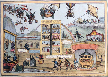
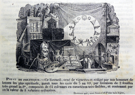
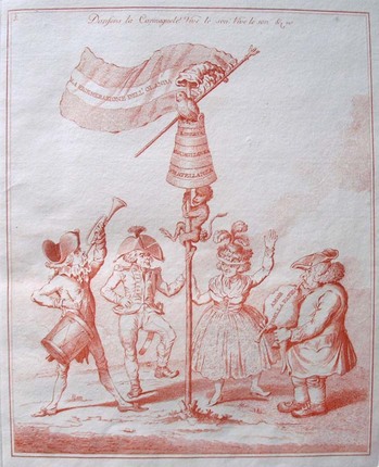
William Heath created three large, multifaceted satires of the Society for the Diffusion of Useful Knowledge (SDUK). The first and third can be found in most collections of British caricature, including ours, but the second is very rare. Thanks to the Friends of the Princeton University Library, the Graphic Arts Collection has now acquired this plate in honor of Dale Roylance.
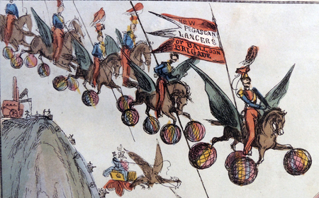
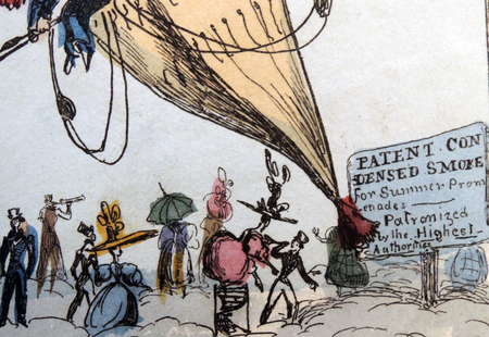
The complexity of the scene reflects the cacophony of inventions and intellectual pursuits raging at that time. Heath begins the group in January 1928, following an accident in the Thames Tunnel, and each feature tunnels to locations around the world. Although they are all varied, the first features accidents due to reading and study; the second focuses on inventions and patents; and the third includes fantastical travel machines.
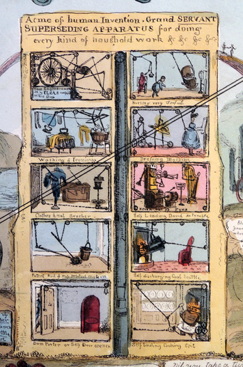
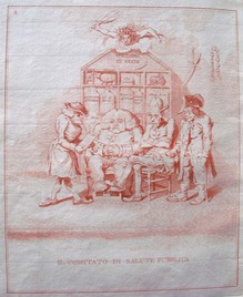
A five-story structure stands at the center of our new print, with ten windows labeled ‘Acme of Human Invention. Grand Servant Superseding Apparatus for Doing Every Kind of Household Work &c, &c, &c.’ Inside each window are different steam-powered machines with elaborate systems of ropes and pulleys for rocking the baby or ironing the clothes or turning the cooking spit. A ‘superseding stair tunnel’ runs up the center.
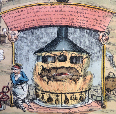
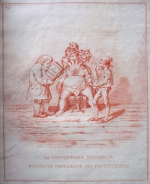
An exploding volcano shoots travelers from Saint Helena in the South Atlantic Ocean and multiple flying machines fill the sky whle at the bottom right, a chef cooks on ‘Patent Fire: Fresh imported from the interior of Mount Etna.’
Recent Comments