A3 — Blackboard

Jeff Snyder
Clayton Whetung
Peter Grabowski
Tae Jun Ham (tae)

  1. Most Severe Problems
    1. H8. Aesthetic and minimalist design / H7. Efficiency of use
      1. There is too much useless information on nearly every page. Consider, for example, the home page. There are links in the form of tabs across the top of every page (BookBag, EdTech services, etc.) that are rarely or never used by most users. Most of the screen real-estate is devoted to blank space or non-Blackboard links. In order to find desired information (course grades), the user must click through several long menus with many non-functional and useless options. We suggest removing unnecessary/rarely used information from the UI to enhance signal-to-noise ratio.
    2. H3. User Control and Freedom
      1. Blackboard presents the user with several situations where it is hard to exit or return to where you want to be. For example, when you start watching a video on video reserves, the back arrow (mysteriously) reloads the page.
    3. H4. Consistency and Standards
      1. There is no clear convention on where specific course items should be located, causing important information to be located in different locations for each course. For example it is very unclear where lecture slides should be posted on the course page, and their location varies from class to class. This makes it very difficult to find what is needed on the course page. In many situations, this results in a system where finding what you need consists of basic guess-and-check. On the video reserves page, Blackboard displays “start, end, and duration” with an unlabelled number after them. The purpose of this number is unclear — we believe it’s the amount of time in seconds for each of the categories.
  1. How did the heuristics help you?
    1. The heuristics were a useful guide throughout the process. We began by reading the list of heuristics, and used it as a “cheat sheet” of common design mistakes to watch out for. The heuristics helped frame our search for design mistakes, and gave us a common language with which to discuss them.
    2. There were also situations where we knew some element of the UI was frustrating to use, awkward, or poorly designed, yet we couldn’t find the words to describe exactly why. The heuristic categories helped us define the issues in a manner that is much easier to communicate to others (potentially including the site’s designers)


  1. Usability problems that didn’t fit into his heuristics
    1. Some basic errors were difficult to categorize. For example, in some places on the site (such as the course guide), there’s broken javascript. The “+” indicator will occasionally simply disappear. Similarly, the “back button” was broken on the video reserves page. Instead of taking you back to the last page, it simply reloaded the page. These could be potentially “jammed’ into one of the above heuristics, but in many cases were too simple a mistake to fit cleanly into a category.
    2. In many cases, the Blackboard interface allows users to customize the interface, hiding and showing certain parts, changing the appearance of objects, and adding and removing widgets. The amount of options provided to the user is large, but the changes made have minimal effect.


  1. Useful class discussion questions
    1. Is there ever a case where having copious text on the screen is useful? Compare craigslist vs. blackboard.
    2. Users may use their browser’s find function (Ctrl+F) to locate desired information. Should we incorporate this consideration when designing interfaces?
    3. Do these heuristics have a high enough fidelity? That is, do they represent specific enough categories for UI problems, or should they be more refined in order to effectively communicate problems? Is the opposite true, i.e. are they too specific?
    4. The disabilities information is displayed front and center for all students. This may be useful for blind students, as many web browsers offer the capability to read the web page to the user. However, this information occupies valuable screen real estate for all other users. Is this a good design decision? In general, do large benefits for a small group of users outweigh minor inconveniences for large groups of users? Is there another way this could have been designed that would optimize the experience for all users?
    5. What would make the best UI for class website / class blackboard page?
    6. How much customization is too much? At what point does giving the user interface options become problematic or lazy design?
    7. How can you make it clear to users what customization options are available?
    8. How do you strike the right balance between too little customization options and way too many?


Links to PDFs of each person’s individual heuristic evaluation

Tae Jun Ham : https://www.dropbox.com/s/ncysr627gnrh0s7/A3_TaeJunHam.pdf

Jeff Snyder : https://dl.dropbox.com/u/22057334/a3%20notes.pdf

Clayton Whetung : https://www.dropbox.com/s/4crnmhifsvxgl4y/Clayton%20Whetung%20-%20Heuristic%20Evaluation.pdf

Peter Grabowski : https://www.dropbox.com/s/4ncswkd8zvyqvsl/HCIA3.pdf


A3: Heuristic Analysis of SCORE

Group: Joseph Bolling, Evan Strasnick, Jacob Simon, Farhan Abrol

Individual Analyses:
Jacob Simon and Evan Strasnick
Farhan Abrol
Joseph Bolling

i. Most Severe Problems

1. Login Failure, Login Hours, and Login Timeout

  • Heuristics violated: H1, H3, H5, H9
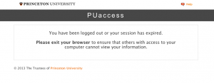
  • Description: We identified two related problems with the SCORE login process. First, users frequently have trouble signing in at all, it throws an error message or open up another window with the same signin screen without any prompts. Secondly , the login is restricted to certain hours, and the error message given is just “invalid signon time” which conveys no information about the reason why it is an invalid time.
    Timeout when navigating to see classes – Information about classes is scattered between Registrars page,Score, and course reviews. In the time it takes to navigate back and forth, SCORE times out the session and you need to sign in again
  • Suggestions: Simplify the login process with more detailed error messages, and navigation links to more information about them. When SCORE signs out automatically, it should have a link to sign in again, instead of a CLOSE WINDOW button.

Screen Shot 2013-03-12 at 3.48.31 PM

2. Navigation

  • Heuristics violated: H3, H4, H7, H8
  • Description: There are multiple kinds of navigation available. There are dropdown menus for going to grades etc. There is the top menu bar that has navigation links that don’t necessarily make any sense (Self Help?)
  • Suggestions: Unify navigation into one consistent format (dropdowns/navigation bar) so that information has a logical flow.

ii. Problems made easier to find 
Problems involving H5 and H9 were made easier to find. From first glance, it is hard to recognize where errors might occur. Similarly, H1 is not always thought about but equally important because it emphasizes the usefulness of feedback to the user. If you think about problems that users are likely to have beforehand, it makes easier to identify weak spots in the interface.

iii. Problems not identified through Neilen’s heuristics 
We listed the “Invalid Logon Time” error as a significant problem above, but another issue we had with the logon time restrictions was the fact that SCORE is locked down for a slightly longer period on Wednesdays. We find this issue confusing and inconveniencing, but since it pertains more to the behavior of SCORE itself rather than the usability of the interface, we had difficulty classifying it with the interface heuristics.

Similarly, we had difficulty classifying other features that were annoying, but which stemmed from fundamentally necessary security concerns-the 15 minute timed logoff is inconveniencing and very annoying, but it was implemented regardless of this fact because it makes SCORE more secure. The same is true of the convoluted sign-on process that requires at least three pieces of user information. While we understand the need for such features and don’t see a way to solve them using mere corrections to SCORE’s interface, we wonder if perhaps there is a change that could be implemented on a more fundamental level that would make them unnecessary. For now, we have difficulty fitting them within the framework of Nielson’s heuristics.

Possible discussion questions

  • differentiate between similar heuristics
  • classify problems with a system as either UI problems (fitting under the heuristics) and functionality/system problems
  • propose changes to an example violation of each heuristic

A3 – Score

Names:

Osman Khwaja, Jae Lee, Prakhar Agarwal

Links to Individual Posts

Jae Lee – Jae’s Notes

Osman Khwaja – Osman’s Notes

Prakhar Agarwal – Prakhar’s Notes

Discussion:

Question 1:
– Menu system is convoluted and not representative to the high volume usage. The most often used thing (the pulldown menu) takes up very little space whereas things that one almost never considers (contact info, hold, more services) takes up a larger majority of the screen.

– Navigation is wacky. The student center is listed under multiple spots (Favorites, self service, and main menu, and has its own link). It is extremely redundant and not intuitive to try to navigate through this site without practice.

– Fix the display usage problem. The pull down menu (which is used most of the time) should be displayed prominently on the screen while things like holds and campus connections should be minimized or something.

– Clean up the navigation by including a top-level menu which is highlighted. It would allow you switch into categories that makes your sub-options easier to find. For example, you should be able to select Courses which would then let you select add, swap, and drop. You should also be able to switch into Payroll, which would give you access to the variety of options that are currently hard to find.

– Get rid of the home page, and potentially make the Student Center the home page, after making some UI updates.

Question 2
For the most part, we found issues which we then matched to Nielsen’s heuristics. However, in some cases it did help to have the list in front of us. In particular, I only thought of the problem with the error message in the add/drop/swap section after reading about how a proper error message should be constructed.

Question 3
The standards are pretty solid, but we would have some improvement for those. Some of the heuristics are pretty general, and they apply to a wide variety of different errors. For example, the consistency and standards is a pretty broad option. One way to break it down would be to make new heuristics that say “Follows current, successful trends for layouts of presented options” as well as a “Presented options operate as described” to replace the “Consistency and Standards” one.

Question 4
– Does the heuristics system properly describe all the errors of all systems or do the nature of some application interfaces correspond only to a certain set of issues?

– Do you think the heuristics are too broad or too specific? Explain.

Art-duino

Group 18

Bonnie (bmeisenm@), Erica (eportnoy@), Mario (mmcgil@), Valya (vbarboy@)

Description

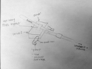
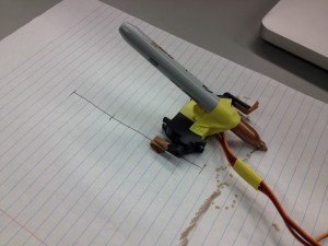
We built a mini-crawler robot that draws a path behind it to make interesting designs. We chose this design for a variety of reasons. First and foremost, we experimented with attaching our other materials to the motors, and most of them were too heavy for the motors to handle. In particular, we wanted to use the DC motor to drive a wheel, but all materials were too heavy for it. For this reason using the slinky or other toys was not an option. We also liked the idea of combining the two servos to make legs, and adding the marker on top was interesting because we could visually track even minimal movement. In the end, we liked the cool random patterns that our Art-duino made. That being said, it moves more slowly than we would have liked, because it was very difficult to deal with the friction and the lack of forward power. Because the servos can only turn 180 degrees, we had to find some way to allow the arms to reset to their original positions, without moving the Art-duino backwards. Our solution to this were the “paws” (see sketch), which were good at battling the friction, but not too great. Since the two servos push the bot alternately forward and backwards, the paws create an asymmetry by increasing the force due to friction in the forward direction. We also wish we could make the motion more deterministic, although the randomness creates cool images.

Brainstorming

  1. We have an android doll. We could put cardboard underneath, and give it wire spools to make it roll.
  2. We have a string of beads which turns, and whatever is at the end of the chain is the robot, like a puppy!
  3. String of wire, with a motor attached to one end, as it winds the spool the robot will climb, like a spider!
  4. We have a little music box. Our robot would have a piezo sound sensor, and it would move when it heard music.
  5. A little reptile-robot that spins around until it finds light, and then crawls towards the light.
  6. Slinky-robot that dances to the music, by flipping and flopping around.
  7. Max (from Where the Wild Things Are) can come bring you a flower, on his little cardboard boat.
  8. A robot that runs away when it senses vibrations (for example, stomping).
  9. A maze of cards that the robot moves through. It does this by trying to go forward, and if it can’t do so it turns 90 degrees and continues.
  10. A robot that doesn’t like to be touched: it runs away from your hand, using a proximity sensor.
  11. A robot that moves in random patterns due to vibrations caused by an imbalanced motor.
  12. A mecha robot that walks upright using servos to move its legs.

Design sketches

A sketch of Art-duino

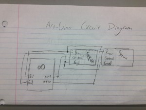
The circuit diagram for our final design.

Art-duino’s final form.

Video

This video shows the tape-pawed prototype of Art-duino in action, along with earlier prototypes and experiments to make the crawler move.

Parts List

  • 2 servos
  • 2 one-armed horns
  • paper plate
  • sharpie
  • electrical tape
  • wires
  • breadboard
  • Arduino

Instructions

First use electrical tape to connect the two servos. The wires should both be in the middle, facing forward. Connect the one-armed horns so that they sweep in opposite directions. Connect this to your Arduino, as indicated in the circuit diagram. Cut a tiny bit off of the paper plate, to make the paws, and tape them so that the paw faces forward (like a dog), and so that they are completely covered with tape. Then attach a sharpie (facing backwards), so that the robot draws as it walks.

Source Code

/*
Based on Adafruit Arduino - Lesson 14. Sweep
*/

#include <Servo.h>

int servoPin = 9;
int servoPin2 = 10;

Servo servo;
Servo servo2;

int angle = 0;   // servo position in degrees

void setup()
{
    servo.attach(servoPin);
    servo2.attach(servoPin2);
}

int speed1 = 0;
int speed2 = 0;
void loop()
{
    // scan from 0 to 180 degrees
    for(angle = 0; angle < 180; angle++)
    {
        servo.write(angle);
        servo2.write(angle);
        delay(5);
    }

    // now scan back from 180 to 0 degrees
    for(angle = 180; angle > 0; angle--)
    {
        servo.write(angle);
        servo2.write(angle);
        delay(5);
    }
}

Assignment 3 – SCORE – Mario Alvarez, Dillon Reisman, Abbi Ward

Names: Mario Alvarez, Dillon Reisman, Abbi Ward

NetIDs: mmcgil, dreisman, aaward

Interface: SCORE

Links to Individual Posts:

Question 1 Most severe problems:

  • You don’t know where to find information and finding it is not natural
    • Division between “Enroll” and “Academics” headings doesn’t make very much sense
    • Quintile rank is under “term information” subheading
    • GPA and Quintile rank are NOT under grades information
    • H2
      • The SCORE navigation organization doesn’t match what people would think it should be.
  • Fixes
    • Information should be consolidated. It is unnecessarily spread out in arbitrary categories and these divisions are not necessary.
      • For example, quintile rank and GPA could be combined with all other grade information.
    • Information should not be unnecessarily redundant
      • For example, the information under “General Education Requirements” and “Academic Requirements” is partially the same. General Education Requirements is not necessary.
  • SCORE is ugly
    • It uses only a small portion of the screen.
      • H8
    • It doesn’t allow customization nor does it automatically give easy access to information people usually want
      • H8
    • There are no icons, so users have to rely on recall and this is also non-standard because most programs and sites use icons.
      • H6
    • Menus are used inconsistently. They’re normally used to select something but here they’re used as a link
      • H4
  • Fixes
    • Redesign the interface (There is no easy fix here!)
    • Use icons
      • For example, a picture of a B+ could symbolize grades
    • Stop using weird combinations of drop-down menus that are also links
    • Use menus and links consistently (H4)

Question 2

SCORE’s help and documentation information does in fact exist! However, it is very difficult to find, is all textual, and contains no screenshots. We would not have found this if we didn’t have these heuristics (H10) guiding us. We also found an error in viewing Academic records. (To replicate the error, go to View My Academic Record, generate a report, click the back button in the browser, and then go view it again. SCORE takes you to a page that says “This Page is Not Available”). If we hadn’t been exploring the various paths in SCORE’s interface and considering H5, we might not have considered this an unnecessary error.

Question 3

We were mostly able to categorize usability problems under one of these heuristics. The redundant information problem on SCORE doesn’t really fall under a category easily, and generally these heuristics may miss some aspects of organizing content. Our additional heuristic might be “minimalist content”. Additionally, we feel that it should be easy to have a mental model of the how the interface works. This might be a sub-heuristic of H2; content should be displayed and organized in a natural way and in a way that aligns with how people organize information in their heads.

Question 4

  • Can we create general rules for creating hierarchies of content?
    • How deeply nested can an informational website be before it becomes cumbersome? Why?
  • Exam question: Give an example interface and have students evaluate it according to a smaller set of heuristics
  • Break down a given heuristic into sub-heuristics.
  • Prioritize the heuristics based on the severity of problems typically associated with them
    • For instance, H2 may be more important than H10 in many cases

P2 – Group 14 (Chewbacca)

Lab 14

Stephen: wrote up the descriptions of the interviewed users and most of the contextual inquiry sections were planned here. Helped conduct interviews.
Karena: drew the 3 different story boards, helped with the task analysis questions, worked on writing up the interface design questions
Jean: helped conduct interviews, contextual inquiry writeups, also wrote up the tasks for the users
Eugene: drew the pictures and answered the task analysis questions, helped conduct the interviews

Problem and solution overview
We are addressing the problem of taking care of a dog, which involves tasks that are often shared between multiple people, completed/monitored by routine and memory, and sometimes entrusted to others when owners leave their dogs for extended periods of time.  These tasks, the most important of which are feeding, exercising, and monitoring a dog’s location, are currently done through imprecise measures, cannot be monitored over long periods of time, and are periodically forgotten.  We propose a system that involves a device that can be attached to a dog’s food and water bowl and a separate device that can be put on its collar, which detects the dog’s food and water intake, how much exercise or activity it has gotten, and its location, and aggregates this data for viewing on a mobile device.  The devices alert the owner when the dog has not been fed according to schedule and, tracks whether the dog has gotten enough activity over time, and shows its location, so owners can check up on it when they are not home.

Description of users you observed in the contextual inquiry

Our target user group is dog-owners who are concerned about their dogs health and who must spend time away from their household due to business, vacation, etc. They might share responsibility for the dog with others, and when they leave their house they must leave their dog alone in their house with either a neighbor or a paid caretaker to watch after the dog.We chose this target group because they would benefit the most from our idea, and have a currently strong need that must be resolved. Our first interviewee was a high-school student who owns a beagle. She shares the responsibilities for the dog with her sister, and says she forgets to feed her dog about every two weeks. When she travels with her family, they usually ask her neighbor. Our second user is a graduate student who lives on campus with his dog.  He is its primary caretaker, but he has to leave it inside while he teaches classes and does work in the lab.  He says his lab schedule is often unpredictable and runs over time, so he cannot follow a regular routine and is concerned his dog doesn’t get enough activity. Our last interviewee was a stay-at-home mother whose kids have all moved out of the house. She owns a dog (and two cats) and is its primary caretaker. She usually completes all of the tasks involved in taking care of her dog right before and right after work.  She is very routine-driven and rarely forgets to take care of her dog, but she becomes extremely stressed when she is away from home because she worries if it is ok.  This makes it hard for her to visit her kids or go on vacation for extended periods of time.

CI interview descriptions

We conducted several interviews, in a variety of different locations. Our general approach was twofold: we observed and eventually approached dog-owners while they walked around campus with their dog, and we asked owners who were at home with their dog. Our approach was to observe the owners as they went by with their dogs on campus, and take notes of our observations. We asked some preliminary questions to people we knew who have dogs at home, and then asked if we could talk to the primary caretakers in their family.  The graduate student who we interviewed was someone that we had observed walking their dog around our dorm room, and who we approached and asked questions.

All of our users definitely cared deeply about their dog’s well being and felt that their dog was important to them in their life. All of users were also busy and reported forgotting to feed their dog at least periodically. The high-schooler we interviewed was unique in that she was the only person who shared responsibility for her dog. She also mentioned that her dog often has other medical needs that need to be done on a recurring schedule, which suggested additional functionality for our interface, such as another button that would allow for checking up on personalized activities like giving medicine.  The graduate student we interviewed was unique because he had a more unpredictable schedule than the other users, and had the most trouble following a routine, and would probably benefit the most from a mobile device. The stay-at-home mom we interviewed was unique in that she didn’t really have many issues with feeding or exercising with her dog. She was also unique in how anxious she said she got when she was away from her dog.  She said that this is actually a constraint for how long she can leave the house, so this feedback would allow her to feel more relaxed during holidays/on vacations. It makes sense that all of the owners we interviewed cared about their dog and were interested in improving their dog’s lifestyle for the better. However, it is clear that different lifestyles/ages (students or working adults) lead to different issues in taking care of a pet.

Answers to 11 task analysis questions
1. Who is going to use the system?
Our target user group – dog-owners who have a vested interest in the well-being of their dog yet are too busy to sufficiently do so.

2. What tasks do they now perform?
Our current target user group feeds the dog, gives the dog water, walks the dog, and must make sure the dog stays within the appropriate boundaries (by putting up fences, etc.). If the dog owner must leave for vacation, they must make arrangements with someone for their dog to be taken care of while they are gone.

3. What tasks are desired?
One desired task is to set reminders for the user to feed the dog, or allow multiple people to feed a dog with little overlap. Another task would be to check up on the dog to know if they are getting sufficient exercise and staying healthy, relative to what they are eating. Also, it would be helpful to easily transition between users, so that if a user is going away for vacation, their dogsitter can easily know when to feed the dog, while the user can know if their dog is being taken care of appropriately.

4. How are the tasks learned?
The tasks are very visual, and therefore, easy to learn. The system is automated and serves as a friendly reminder to perform tasks. As soon as the user becomes familiar with how the reminders/updates about his/her dog work, he/she will learn how to respond to them, and therefore, learn the tasks.

5. Where are the tasks performed?
The tasks are mainly performed within the household – feeding the dog, giving the dog water, or walking outside around the house. The task of checking up on your dog while away from the household is done in any location.

6. What’s the relationship between the user and data?
The user will receive data about their dog (charts about fitness level and dietary intake), and the location of their dog through a mobile app connected to the bowl-collar system. The user can also receive alerts if any of these levels are outside a reasonable range. Given certain data, the user may change their behavior (giving less food, exercising more, etc.)

7. What other tools does the user have?
Users will also most likely have mobile phones that they can use in conjunction with this system. They will probably also have calendars, either electronic or not, that will be used to schedule important events for their dog. We can facilitate interaction amongst these devices by having the mobile phone, email, etc. all connecting to this app.

8. How do users communicate with each other?
The users of the system communicate implicitly with one another. For instance, the job of feeding the dog becomes a shared task under this system; if one person forgets, all the owners of the dog will get notified about the dog being hungry, and they can respond to this reminder. Thus, the responsibility of feeding the dog becomes a shared responsibility.

9. How often are the tasks performed?
Two of the tasks are performed on a daily basis. The activity monitor that senses the motion of the dog, and how active it has been, occurs in real-time. Meanwhile, the food reminders occur whenever the user has forgotten to feed the dog; this will vary from user-to-user. Finally, the task that serves to ensure the user that the dog has gotten fed when the owner is away, will be performed when the user has left for an extended period of time; this also varies depending on the user. The GPS tracking system will be used as frequently as the dog escapes from the backyard.

10. What are the time constraints on the tasks?
The time constraints on the tasks are not extremely relevant. As long as the reminder that the dog has not been fed is sent in a timely fashion (within 1 hour), the system should be useful to the user. When the user is getting updates (while on vacation) about the well-being of his/her dog, timing might be a little more relevant. Still, the data can be sent with a 1-2 hour grace period.

11. What happens when things go wrong?
When things go wrong–perhaps the weighing system is not calibrated well enough and the food is constantly setting alerts or maybe the activity monitor is not outputting the relevant data– the user will get unreliable data that could harm the pet, or rather, simply annoy the user.. Also, if the collar were to be removed by accident, it may omit important data to the user (the user wouldn’t be able to locate where the dog is, etc.)

Description of three tasks

Task 1: Checking who last fed the dog and when, and deciding when/whether to feed their dog.

Currently, this task is done mainly through routine and memory.  Dog owners typically have some kind of system set up with family members/apartment-mates, etc, where they split up responsibility for feeding their dog.  They have a routine for how much, how many times a day, and at what times they feed their dog, and they remember to do this task by habit (maybe feeding their dog when they eat). An owner might feed their dog twice a day in the same amount (a measuring cup), once in the morning and once in the evening. If multiple people share responsibility for feeding the dog, they might communicate orally or by texting, etc, to ask each other whether they have fed the dog.  This task is currently not very difficult, as it becomes habitual over time, but coordinating with multiple family members may pose intermittent problems, and most users report periodically forgetting to feed their dog.  Using our proposed system, coordinating this task with multiple people would be much easier, as the user would only need to check the dog bowl to see whether it is necessary to feed their pet.  In addition, the number of times the user forgets to feed their dog would be reduced, as the system would ping their mobile device when the usual feeding schedule has not been followed.

Task 2: Checking and regulating the activity of your dog

Currently, dog-owners check and regulate their dog’s activity through routine, memory, and some measure of guesswork.  This is a moderately difficult task.  Owners usually have a routine of how many times per day or week they take their dog on a walk, and they might adjust this according to their schedule (taking a shorter route when they are busier, etc). If they leave their dog outside for extended periods of time, they might guess how much activity they have gotten and use this time in lieu of other forms of activity such as walking.  In addition, activity is monitored and adjusted using relatively recent remembered “data”, such as whether the dog got less activity on a certain day or week (it is harder to remember long-term activity levels and trends).  This might lead a pet to get less activity than needed over an extended period of time and lead to weight gain, etc.  Using our proposed system, checking and regulating a dog’s activity would be much easier, as owners would not have to be reliant on memory.  They would not have to guess how much activity a dog gets when it is left alone outside, and thus would have a more accurate holistic view of their activity.  In addition, users could easily access long-term data about their dog’s activity level, and therefore see trends from over a period of several weeks or months and adjust their schedule accordingly to avoid giving their pet excessive/insufficient exercise.

Task 3: Taking care of your dog when you are away from home for extended periods of time.

Currently, users deal with this problem using a variety of methods.  Typically, they leave their dog in the care of someone they know, usually a neighbor, friend, or family member.  They might give their dogsitter a key to their house so that they can go in every day to feed/walk/check up on their dog, or they might have the dogsitter take the dog to their own home to take care of it.  They usually leave written or oral instructions about how much/how often to feed their dog, how often to let it out, and how much/how often to exercise it.  These dogsitters might have varying experience taking care of pets/dogs, and the owner might check up on the status of their dog by calling or texting the dogsitter periodically.  Overall, this is currently a difficult and stressful task, as many owners worry whether their dog is being taken care of correctly, and they might not know how responsible or trustworthy their dogsitter is.  Using our proposed system, this task would become much easier for both the owner and whoever has responsibility of the dog while the owner is away.  Owners would be able to check the status of their dog remotely, and easily see whether their pet has eaten, been let outside, and walked.  In addition, even dogsitters with very little experience taking care of dogs would find it easier to complete this task, as they would easily be able to see when the dog has not been fed enough, and when they are deviating from its usual schedule.  With mobile pings, they would also be notified when they forget to feed the dog, which might be helpful because it is not part of their regular schedule and is thus not habitual.

Interface Design
1. Text description of the functionality of system

The pet-care system has several functions. It is a system with three main components: a dog water and food bowl with weight sensors and an LED system, a motion-detecting sensor on the collar of the dog which includes a GPS tracking system, and an interface that allows the users to get data and reminders from the system. The weight sensor tracks how much the dog has been fed, and the user will get notified when the user has forgotten to feed the dog, or when their dog has not been eating. The user can also use the system to monitor how often the dog has been exercising, and give a ratio of food that is proportional to the dog’s exercise. When an owner leaves his or her dog in the care of a neighbor or a friend, the system allows the user to get updates about the dog’s activities. The GPS system attached to the collar of the dog will notify the user of the dog’s location. The system that ensures that the dog is cared in all respects, and ensures the safety, health, and attention that a dog needs from its owner. The current device that resembles this system is called Tagg. Tagg, however, features the GPS tracking system and does not have the additional functionality of ensuring that the user’s dog is fed and getting sufficient exercise. Furthermore, our system is fully automated through the bowl and collar devices. This allows the system to cause little interference in the pet-owner’s life, and makes it easy to use.

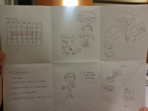
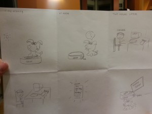
2. 3 StoryBoards
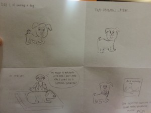
20130312_223752 20130312_223738 20130312_223802


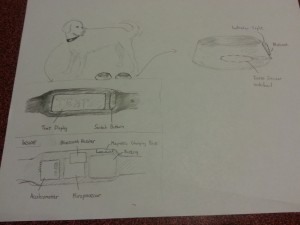
3. A few sketches of the system itself
20130312_220224

A schematic of the actual device, showing the weight-sensing bowl and the text display. It also shows the components: switch button, text display, accelerometer, microprocessor, battery, magnetic charging point, and a bluetooth receiver.
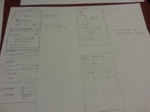
 

20130312_220852

Shows a potential interface for the mobile app that would come associated with the device. The functionality is shown above.

 

Lab 2 – Group 16

Group Members
Andrew Boik (aboik@)
Brian Huang (bwhuang@)
Kevin Lee (kevinlee@)
Saswathi Natta (snatta@)

Group 16

Description

We built three instruments: Instrument of Light, a light detecting theremin from a photo resistor); Lollipop (it kind of looks like one), a proximity theremin using a capacitive proximity sensor; and La Tromba, a trumpet from three FSRs (for valves) and a flex sensor with wind sail attachment (for simulating airflow). All three worked fairly well, except the trumpet was a little difficult to control and the proximity sensor didn’t have a very wide range. In all three, we used a buzzer for sound, except for the trumpet which used a piezo element initially and then a buzzer in the final version. We ultimately decided to develop the trumpet into our final instrument. We were motivated to build this instrument because one of our group members plays trumpet, and we thought it would be interesting to create an electronic version of the instrument. Our final version featured a buzzer instead of piezo element, and we tuned our flex sensor thresholds so less blowing/bending would be required. The combination of FSRs held down is mapped to actual trumpet notes, and the signal from the flex sensor simulates the partial, so bending it further will result in a higher pitch. Overall we think the final result was a success. We liked that we could actually kind of play a scale and go through the trumpet’s full range with it. Our attachment to the FSR was a little bit of a disappointment because it was nearly impossible to control the sound by blowing on it like you would on a real trumpet, so we ended up manually bending the flex sensor instead.

Video

La Tromba (initial)
Use FSR sensors as 3 buttons for the trumpet and the flex sensors to sense when user blows into the trumpet. Sound is only generated when the flex sensor is bent and certain FSR sensors are pressed

La Tromba (initial) Video

Instrument of Light
Depending on the value that the photo resistor outputs, the tone that the buzzer plays will change.

Instrument of Light Video

Lollipop
Music by proximity: Using a capacitive proximity sensor to moderate which pitch that the buzzer plays. The pitch is higher if a person is closer to the sensor.

Lollipop Video

La Tromba (final)

La Tromba (final) Video

Instructions

Instrument of Light (Photo resistor theremin) – Wire a photocell with a voltage divider, using a 10k resistor to ground, between one pin connected to 5V power and the other pin connected to a Arduino analog input pin to detect the resistance.  Wire a buzzer to a chosen Arduino digital output pin and the shorter end to ground.

La Tromba (FSR and flex sensor trumpet) – Wire 3 FSR sensors using 10k pull down resistors for each. Each combination of buttons will produce a different tone. Wire a flex sensor with a 10K pull down resistor inside a hollow tube and when it is bent by wind being blown, it will allow the buzzer to sound a tone.

Lollipop (Capacitive proximity sensor theremin) Wire a capacitive proximity sensor, which is essentially a bit of aluminum just as in http://playground.arduino.cc//Main/CapacitiveSensor?from=Main.CapSense and connect a buzzer to the arduino to output sound depending on the proximity of the person


Materials Used in Final Instrument

1 Arduino
1 Small breadboard
3 FSRs
1 Buzzer
1 Flex sensor
1 Paper wind sensor attachment to flex sensor
4 10K resistors


Code

La Tromba

Source Code Here

Instrument of Light

int light_pin = A0;

int speaker_pin = 8;
void setup() {
 Serial.begin(9600);
 pinMode(8, OUTPUT);
}
void loop() {
 while(1) {
 int reading = analogRead(light_pin);
 Serial.println(reading);
 tone(speaker_pin, reading);
 }
}

Lollipop

#include <CapacitiveSensor.h>
/*
 * CapacitiveSense Library Demo Sketch
 * Paul Badger 2008 edited 2013 by Princeton HCI lab group 16
 * Uses a high value resistor e.g. 10 megohm between send pin and receive pin
 * Resistor effects sensitivity, experiment with values, 50 kilohm - 50 megohm. Larger resistor values yield larger sensor values.
 * Receive pin is the sensor pin - try different amounts of foil/metal on this pin
 * Best results are obtained if sensor foil and wire is covered with an insulator such as paper or plastic sheet
 */
/* Modified by Lab Group 16 COS 436 HCI Spring 2013 */
CapacitiveSensor cs_4_2 = CapacitiveSensor(4,2); // 1 megohm resistor between pins 4 & 2, pin 2 is sensor pin, add wire, foil
long sensorValue;
long sensorHigh = 0;
long sensorLow = 2000;
void setup() 
{
 cs_4_2.set_CS_AutocaL_Millis(0xFFFFFFFF); // turn off autocalibra- //te on channel 1 - just as an example
 Serial.begin(9600);

 // upon starting, we have five seconds to give the proximity
 // detector an upper and lower bound
 while (millis() < 5000) {
 sensorValue = cs_4_2.capacitiveSensor(30);
 if (sensorValue > sensorHigh) {
 sensorHigh = sensorValue;
 }
 if (sensorValue < sensorLow) {
 sensorLow = sensorValue;
 }
 }
 Serial.print("sensorHigh = ");
 Serial.println(sensorHigh);
 Serial.print("sensorLow = ");
 Serial.println(sensorLow);
}
void loop() 
{
 sensorValue = cs_4_2.capacitiveSensor(30);

 // map the sensor values to a wide range of pitches
 int pitch = map(sensorValue, sensorLow, sensorHigh, 1047, 131);

 // play the tone for [duration] ms on pin 8
 tone(8, pitch);
}


A3: Heuristic Evaluation

Names: Colleen, Vivian, Alan

1. What were the most severe prob­lems with the app/site? How do these prob­lems fit into Nielsen’s heuris­tic cat­e­gories? What are some sug­ges­tions to fix the UI, and how do your proposed changes relate to the heuris­tic categories?

  • Most severe problems:
    • No documentation (or tutorial) for how to use it
    • Not intuitive (have to switch between tabs)
    • No consistency across different platforms (Android/iPhone)
    • Can’t choose a stop and have to choose a route
    • Not useful for planning travel, can only pick one transit system
    • Really hard to figure out stops (on Android, can’t even see route intially, don’t know you can click on it)
    • Multiple routes were in the same color.
  • This application violates almost all Nielson’s categories except:
    • Doesn’t violate “Aesthetic design and Simplicity” (H8) but the simplicity comes at a sacrifice of functionality and instruction.
    • Also doesn’t violate “Match between system and real world” (H2) because its mostly based off of conventions from other technologies, and it relies on understood icons used already in Google maps and other technologies.
    • Did not violate “Help users recognize, diagnose, and recover from errors” (H9) because there were no error messages.
  • Suggestions to fix UI:
    • Make stops more visible (H6/H7)
    • Make specific stops searchable (H7)
    • Have all the routes initially selected so that the user doesn’t have to click and extra button when the map loads and nothing shows up (iPhone version) (H7)
    • Some sort of tutorial about how to get important information (H10)
    • Make sure routes are all different colors (H4) and that the routes are clearly distinguishable (H5)
  • Make changing the transit system easier, instead of needing to switch to the “Settings” tab (iPhone) (H3)
  • Doesn’t save previous states (which routes already selected) when switching between tabs or transit systems (H6/H7)
  • Doesn’t notify user when the times until the bus arrives at stop are updated (H1)
  • Announcements aren’t reflected in the route data or on the map (H5/H7)

2. Which problems, if any, were made easier to find (or potentially easier to correct) by the list of Nielsen’s heuristics?

  • Would not noticed the problems with loading data looking error (H5) and wouldn’t have been as bothered by lack of documentation (H10). Overall, the problems with the interface were pretty obvious and glaring. Without Nielson’s heuristics, probably would not have tried to access other transit systems (maybe would have just looked at Princeton ones) which helped identify user control and freedom (H3), recognition and recall (H6), and consistency and standards (H4).

3. Did anyone encounter usability problems that seemed to not be included under any of Nielsen’s heuristics? If so, what additional heuristics might you propose for this type of application or site?

  • Speed factor (each tab needs to load) is not included in the user heuristics but is kind of annoying for the user and definitely affects your experience (esp. on Android). For any time-relevant application, need to consider performance time.
  • For mobile, efficiency of interaction space (phone is considerably smaller than desktop) and should be considered. For example, choosing all routes clutters small screen with many colors/dots/icons (confusing). Can be considered part of Aesthetics (H8), but maybe should be a separate heuristic.

4. What might be some useful class discussion questions—or final exam questions— related to heuristic evaluation?

  • What would be most important heuristics to prioritize?
  • Would the important heuristics change depending platform (mobile vs. computer)?
  • Would the way you evaluate these heuristics differently depending on the time period (now vs. 1980)?
  • Should there be any heuristics added (like speed of interface)?

Individual Heuristic Evaluation:

View Vivian’s observations here.

View Colleen & Alan’s (worked together due to lack of computer) observations here.


Assignment 3

Group Members: Matt, Alice, Ed, Brian

What were the most severe problems with the app/site? How do these problems fit
into Nielsen’s heuristic categories? What are some suggestions to fix the UI, and
how do your proposed changes relate to the heuristic categories?

Logging in does not always work:

  • Logging only works about half of the time.
  • This fits within H9.  Doesn’t tell you why there is an error and there is no graceful recovery.
  • Which problems, if any, were made easier to find (or potentially easier to correct)

Help menus don’t actually exist:

  • Help menus are in Window’s ’98 format
  • Most of the links crash
  • The falls under H10

https://dl.dropbox.com/u/49220792/score_menu.png

There are no icons anywhere

  • For example, finding quintile rank.  You just have to know where it is or have someone tell you.
  • This falls broadly under H6

http://dl.dropbox.com/u/25731678/Screen%20Shot%202013-03-12%20at%204.00.10%20PM.png

No consistency on the site (Violates H4)

  • Mixture of links, tabs, and dropdowns
  • H2: Their conceptions of tabs is weird.  Clicking on a tab can bring you to a new page.

Which problems, if any, were made easier to find (or potentially easier to correct)
by the list of Nielsen’s heuristics? (That is, if we had asked you to perform a
usability evaluation of the app/site without first discussing heuristics, what might
you have overlooked?)

Help and Documentation

  • I would never have otherwise looked at the documentations

Lack of Icons

  • It’s not something you actually think about.  How much you use icons to navigate through a web page.

Did anyone encounter usability problems that seemed to not be included under
any of Nielsen’s heuristics? If so, what additional heuristics might you propose
for this type of application or site?

  • When the help just crashes or the login just doesn’t work.  That is just a bug.  Maybe adding a heuristic for “just not working.”
  • Unnecessary Functionality (It’s not quite minimalist design its a little different):  For example you can email someone from inside SCORE and no one every does that.
  • Usability across different devices:  SCORE doesn’t work at all on mobile or tablet devices.

What might be some useful class discussion questions—or final exam questions—
related to heuristic evaluation?

  • Why is recognition vs. recall important?
  • What are some examples of “matching between the system and the real world”?
  • What are some methods of preventing users from making errors?
  • Which of these heuristics might provide the biggest impact on the users?  Which is most likely to lead to high severity problems?

PDF’s of Students Notes:

A3: Craigslist Heuristic Evaluation

Group Members:

Xin Yang Yak (xyak@)
Gabriel Chen (gcthree@)
Peter Yu (keunwooy@)

i. Most severe problems

The most severe problems we found with the site are listed as follows, with their corresponding violations:

H2: Unrealistic names and uncommon abbreviations for discussion subforum links.
H6: Homepage is recall dependent, lacking icons for recognition.
H7: Lack of login page impedes efficient use.
H8: Discussion subforum interface is cluttered and not minimalistic.
H10: Help function uses google site search and documentation is not thorough.

ii. Problems exposed by Nielsen’s heuristics

We wouldn’t have thought to look at the help functionality of Craigslist if it weren’t included in the list of heuristics. The problems with its functionality were exposed by the list.

iii. Usability problems beyond Nielsen’s heuristics

The site was aesthetically bad and discourages users from using it. The site looks unreliable, which is not a good quality for an ecommerce site.

Possible additional heuristics should thus incorporate the site’s look and feel, and how welcoming it is toward a user.

iv. Class discussion questions

1. What are the limitations of Nielsen’s heuristic evaluation?
2. What are the shortcomings of Nielsen’s heuristic evaluation?
3. Apply heuristic evaluation to the HCI course website.
4. What is the timeframe of Nielsen’s heuristic evaluations? Will the evaluation criteria persist as technology evolves?

Links

Xin Yang: https://docs.google.com/document/d/1LwwD1IGgCtKNfSXfeZU5TNabKaD32M2Srjl3vhDrHp0/edit?usp=sharing

Gabriel: https://www.dropbox.com/s/xs801hxemaiwa5b/A3.pdf

Peter: https://www.dropbox.com/s/zpwhr9btafk3f1b/inclass.pdf